


The digital age has changed many of the ways we present and view information in the media. Data is no longer just boring information used to justify statements or as evidence for claims. Many media organisations now have roles for journalists solely focused on conducting data investigations and presenting findings in clever graphics.
Well-presented data can be used as the key feature or selling point for a journalist highlighting an issue to their audience, and similarly, for PR agencies and professionals to pitch their stories to the media.
For some inspiration on how to present your data in a compelling and visually appealing way, have a look at these five great articles in 2020:
1. Coronavirus simulation
In March 2020 as the COVID-19 crisis was escalating around the world, The Washington Post Graphics Reporter Harry Stevens created this simulation to demonstrate how the spread of the virus can be slowed by social distancing. This simulation (which is unique to every viewer) simplified complex data into easy-to-understand modelling. It has now been translated into 13 languages and become one of the most-viewed stories ever produced by The Post.

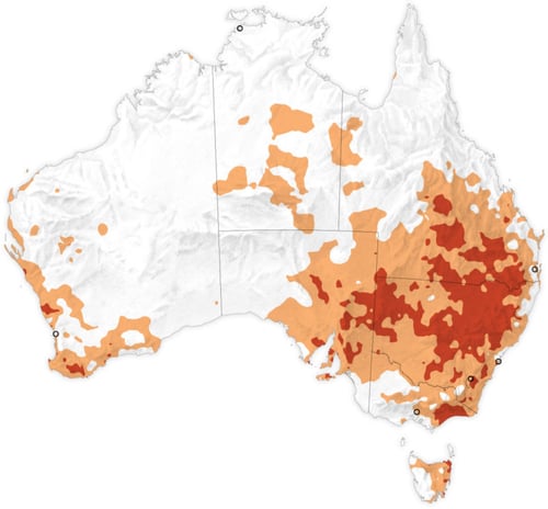
2. Australian bushfires
Frequently in the news cycle there are issues or events that every single media organisation is reporting on, so journalists are constantly on the lookout for angles or techniques that will make their content stand out among the rest. This New York Times interactive coverage of the 2019-2020 Australian bushfires demonstrates how the fires compare to other years and the factors which amplified their impact.
3. A “shit” year
Datasets don’t have to be complicated to be interesting or newsworthy. The Guardian is well known for its sophisticated data journalism and visualisation, but this very simple graphic was enough to present survey findings in a dry, humorous way that made a stir on social media.

4. Global warming
Once more The Washington Post is leading the way with their data reporting. The Pulitzer Prize-winning ‘2°C: Beyond the Limit’ series analysed global datasets on over 160 years of temperature records and mapped every county in the US where temperatures have already risen by 2 degrees Celsius. This is the threshold of global warming that experts say will bring about catastrophic impacts on the world. The data was then presented in a series of visually appealing stories that demonstrate the effects global warming has had on the lives of those living in these “hot zones” across the country.
5. Why Cats and Dogs…
Lastly, a fun one! This “visual exploration”, created by Nadieh Bremer in collaboration with Google Trends, looked at data taken from the most frequent Google searches people make about their pets. It’s interactive, informative and colourful. 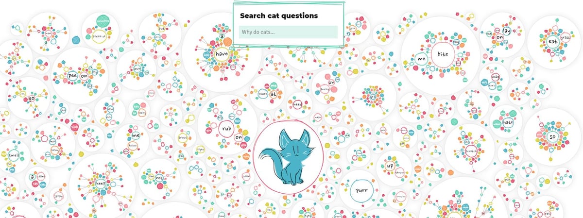
These are examples from some of the best graphics reporters in the world, but your data presentation doesn’t have to be this sophisticated to still catch eyes. Below are some sites you can use to create visually appealing infographics:
Journalists love images, videos and additional resources that provide multiple angles and add depth to a story.
Looking for more inspiration? Check out these articles:
Best Data Visualisation Projects of 2019
Global Investigative Journalism Network’s Data Journalism Top 10
About the Author
Nell O'Shea Carre
Share


